
Freedom’s Found Coffee
Proudly Serving Those Who Serve and have served
Client: Freedom’s Found Coffee • Raymond Herr
Industry: CPG / Coffee / Mission-Driven
Package Category: Multi-Brand Full Rebrand
Freedom's Found Coffee serves as the ambassador for Freedom's Found Initiative, a faith-based organization dedicated to supporting veterans and first responders through trauma healing and Christ-centered community. They needed a brand identity that would honor military service while communicating hope, direction, and the healing journey their organization facilitates through quality coffee and genuine connection.
The Snapshot
THE CHALLENGE
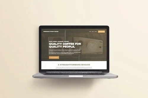
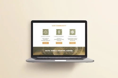
Freedom's Found Coffee needed a brand identity that could carry dual weight: operating as an excellent coffee shop worthy of community support while clearly communicating its deeper mission of veteran trauma healing. The visual identity had to resonate with veterans and first responders who understand military symbolism, while remaining approachable and welcoming to the broader community whose coffee purchases directly support veteran resources.
OUR PROCESS
We began with deep strategic work to understand the intersection of coffee culture, military heritage, and faith-based healing. Our brand foundation intensive focused on translating their core values—Faith, Family, Country, Coffee—into a cohesive visual system. We developed brand architecture that positioned the coffee shop as the front-facing ambassador for the larger Freedom's Found Initiative, ensuring every design decision reinforced their mission of providing hope and healing to those who've served.
THE RESULT
The brand identity successfully positions Freedom's Found Coffee as both a destination for exceptional coffee and a trusted space where veterans can connect, heal, and thrive. The compass symbolism creates immediate recognition and emotional connection with the military community, while the earthy color palette and bold typography communicate stability, authenticity, and the wear of healing. The brand authentically represents their mission: finding the hurting to help them find Christ, one conversation and one cup of coffee at a time.
The Solution
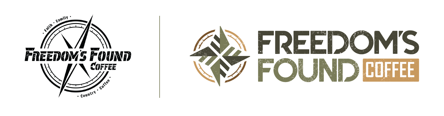
A Compass for the Journey
The brand identity centers on the military-issued lensatic compass—a precision instrument where accurate navigation means the difference between life and death. This powerful metaphor became the foundation for a logo system that represents guidance from trauma to healing, with repeating "F" letterforms serving as both cardinal directions and a mirror to the "Freedom's Found" alliteration. The identity communicates direction, healing, and community.
DELIVERABLES
Brand Strategy
Visual Identity
Concept Designs
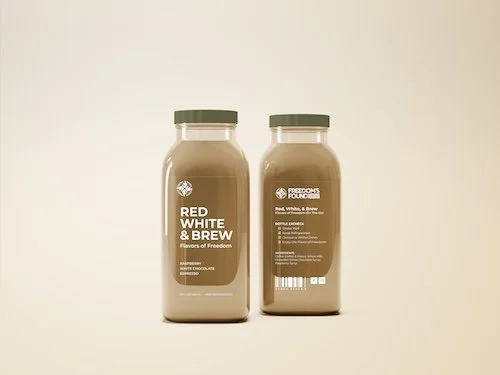
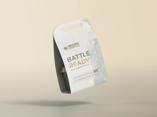
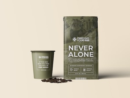
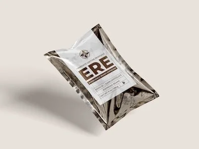
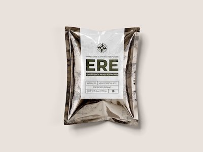
Package Designs (CPG)
Before & After Comparison
KEY INSIGHT
This project exemplifies our philosophy that purpose-driven brands require visual systems grounded in authentic symbolism. By anchoring the identity in the military compass—an object veterans intimately understand—we created more than brand recognition; we created a visual promise of guidance, safety, and hope for those navigating their healing journey.