

Keep the Heart
Taking Bible study from learning to living.
Client: Keep the Heart
Industry: Spiritual Resources
Package Category: Brand Refresh + Add-Ons
Keep the Heart creates relatable resources that help people grow in their faith journey. When founder Francie came to us, she was navigating both a business transition and a deeply personal one. The original logo—those intertwined hearts—had been created with her late husband, making any change feel incredibly meaningful. Add to that her move from Minnesota to Florida, and this project became about so much more than visual identity. It was about honoring the past while creating space for what was next.
Original Logo
The Snapshot
THE CHALLENGE
This wasn't just about brand recognition—it was about preserving something sacred. The refresh needed to reflect the professional growth Keep the Heart had achieved, but honor what Francie and her husband had built together while positioning the brand for this new chapter in both business and life. The challenge was creating evolution that felt respectful, not erasing.
OUR PROCESS
We knew this required our most thoughtful approach. Every conversation started with understanding which elements were sacred because of their emotional significance. Even for this single brand, we applied our ecosystem methodology—building comprehensive strategy around core values, audience insights, and messaging hierarchy—to ensure whatever we created could support Francie's future growth while honoring the legacy she and her husband built together.
THE RESULT
The refresh achieved something beautiful: it felt like a loving tribute rather than a replacement. Francie could see her husband's influence in the refined hearts while also seeing her new chapter reflected in the updated design. Her community embraced the changes, and she finally had the professional credibility to match her impact.


The Solution
A Strategic, Loving Refresh
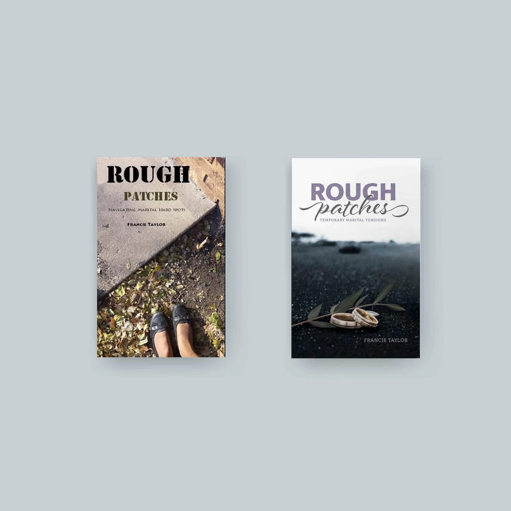
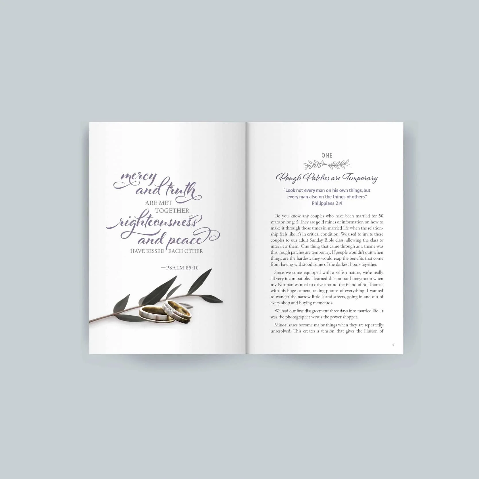
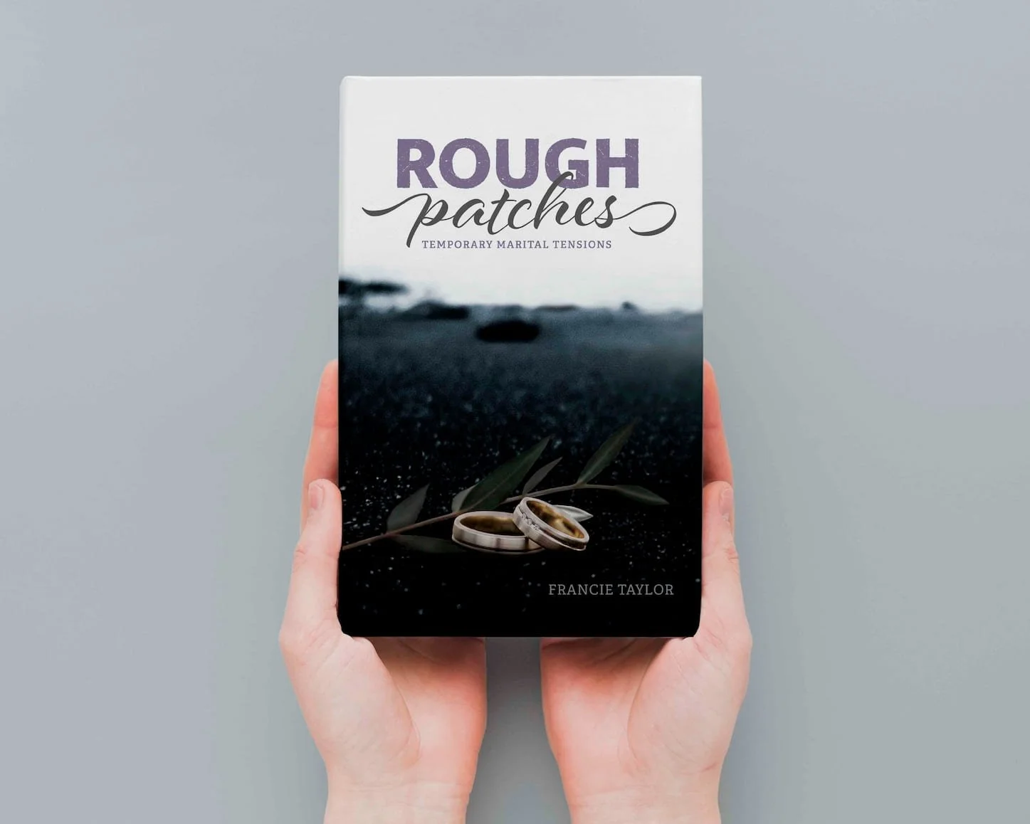
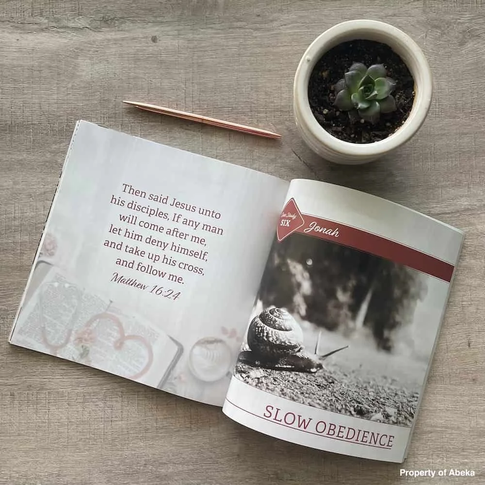
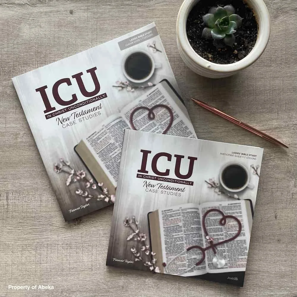
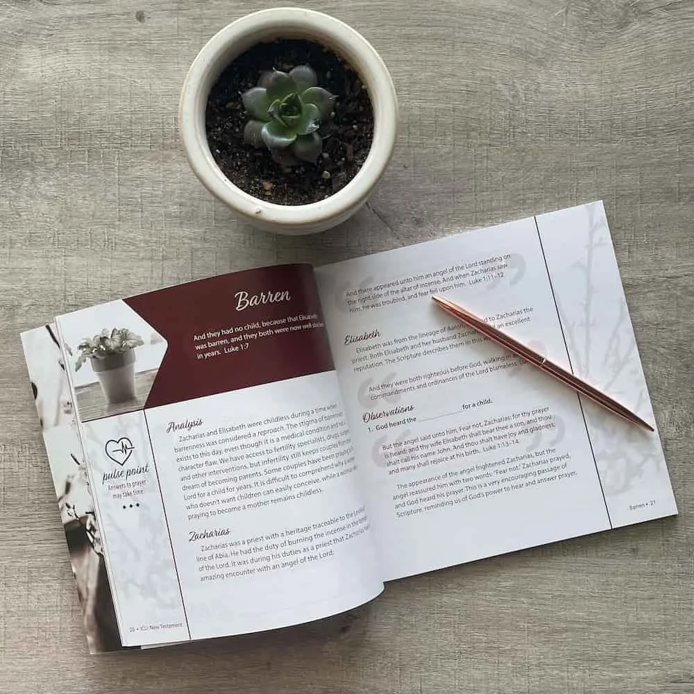
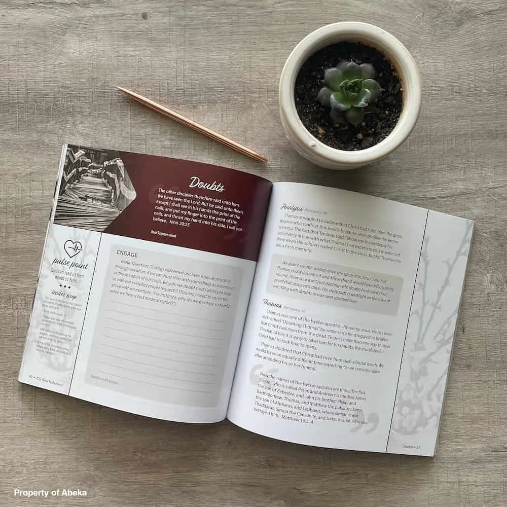
We approached those cherished intertwined hearts like the treasures they were—keeping their essence while giving them a refined, hand-drawn treatment that felt both familiar and fresh. The sophisticated color palette and improved consistency honored the original vision while opening doors for expanded reach. This wasn't about changing what worked; it was about helping something beautiful become even more impactful.
DELIVERABLES
Primary & Secondary Logo Refinement
Brand Style Guide
Business Card Design
Discount Card Design
Podcast Cover
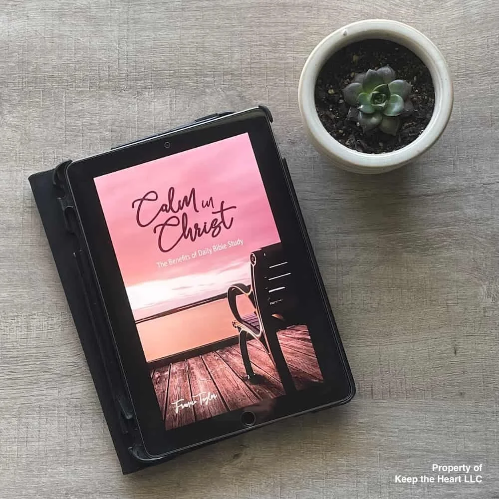
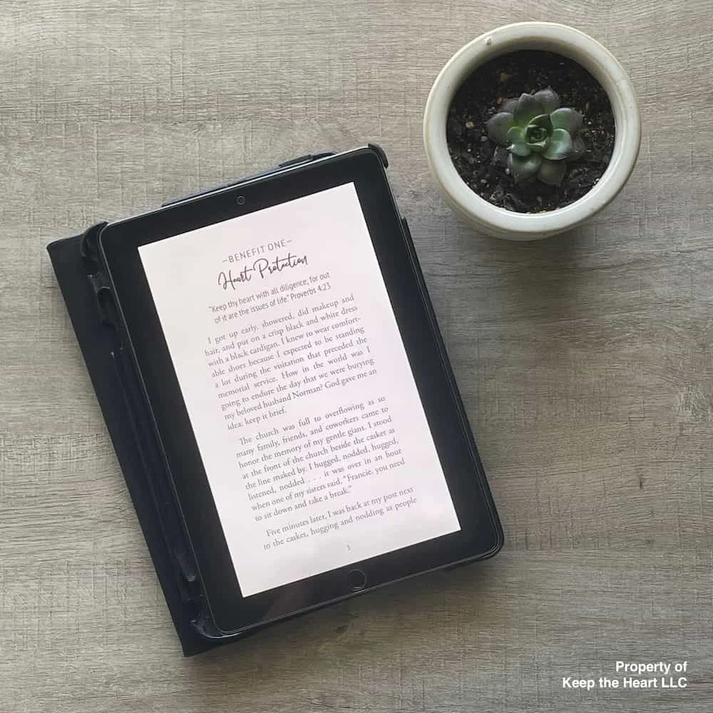
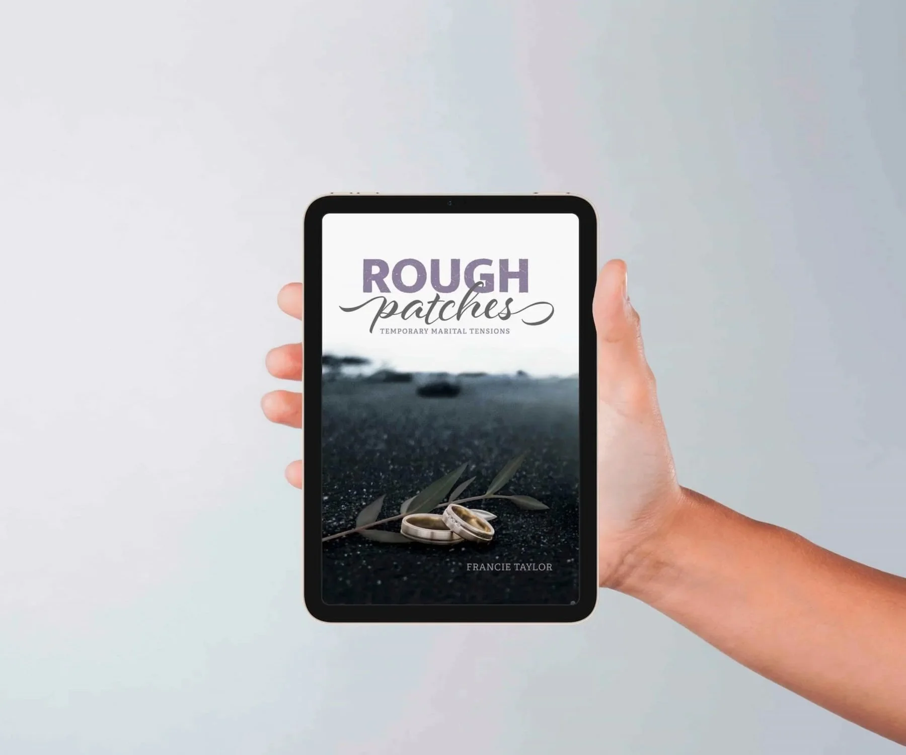
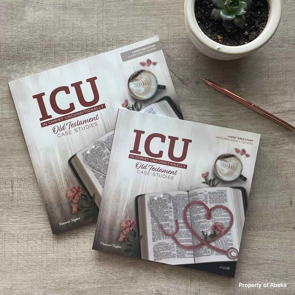
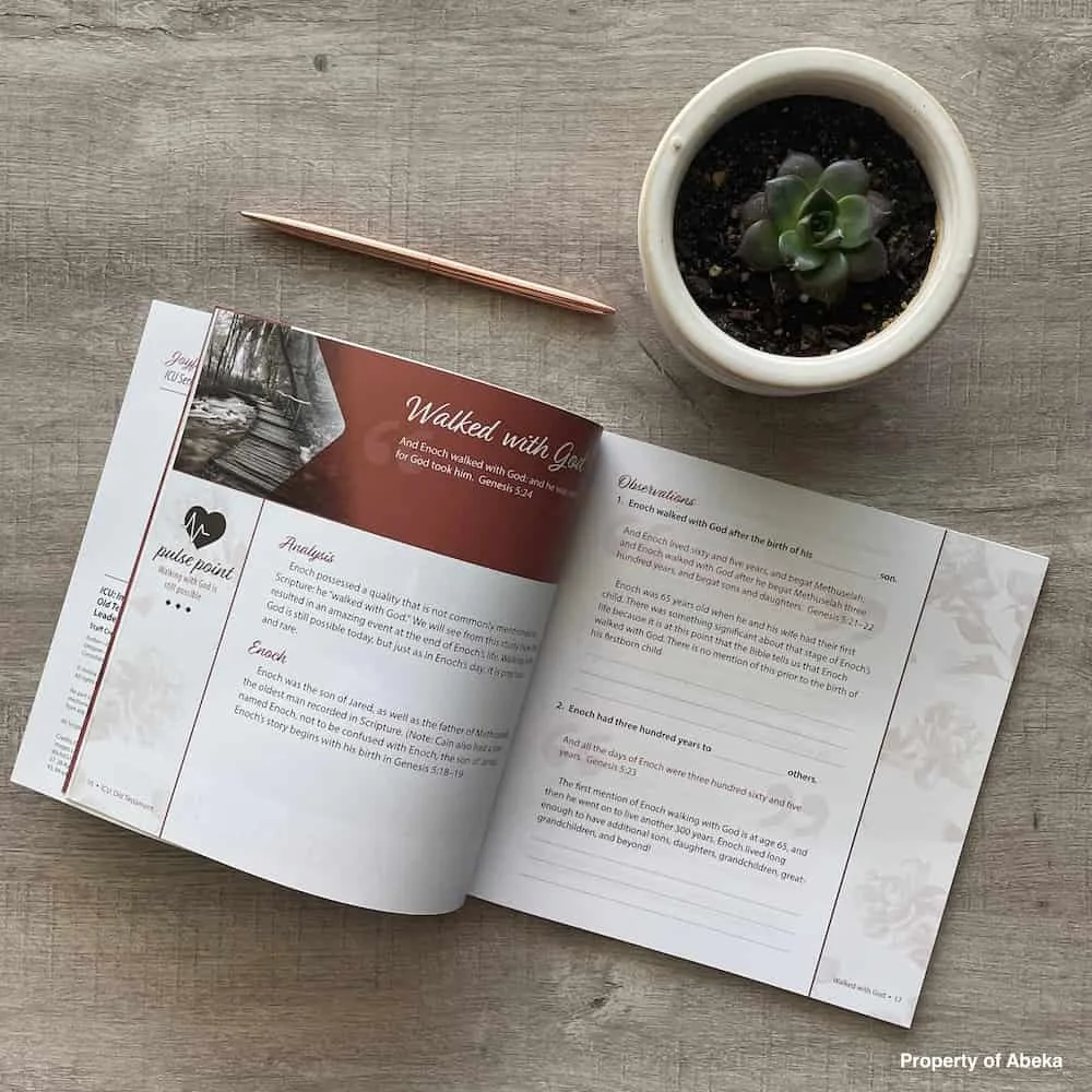
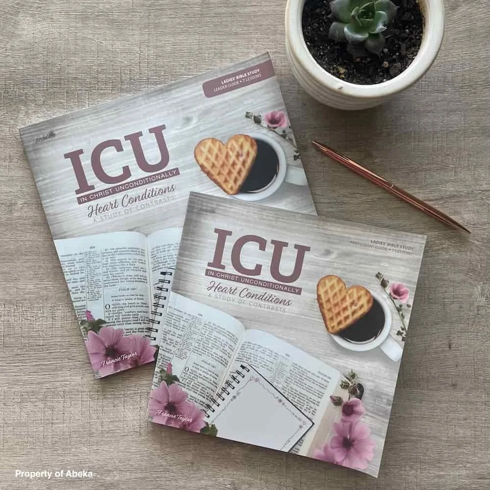
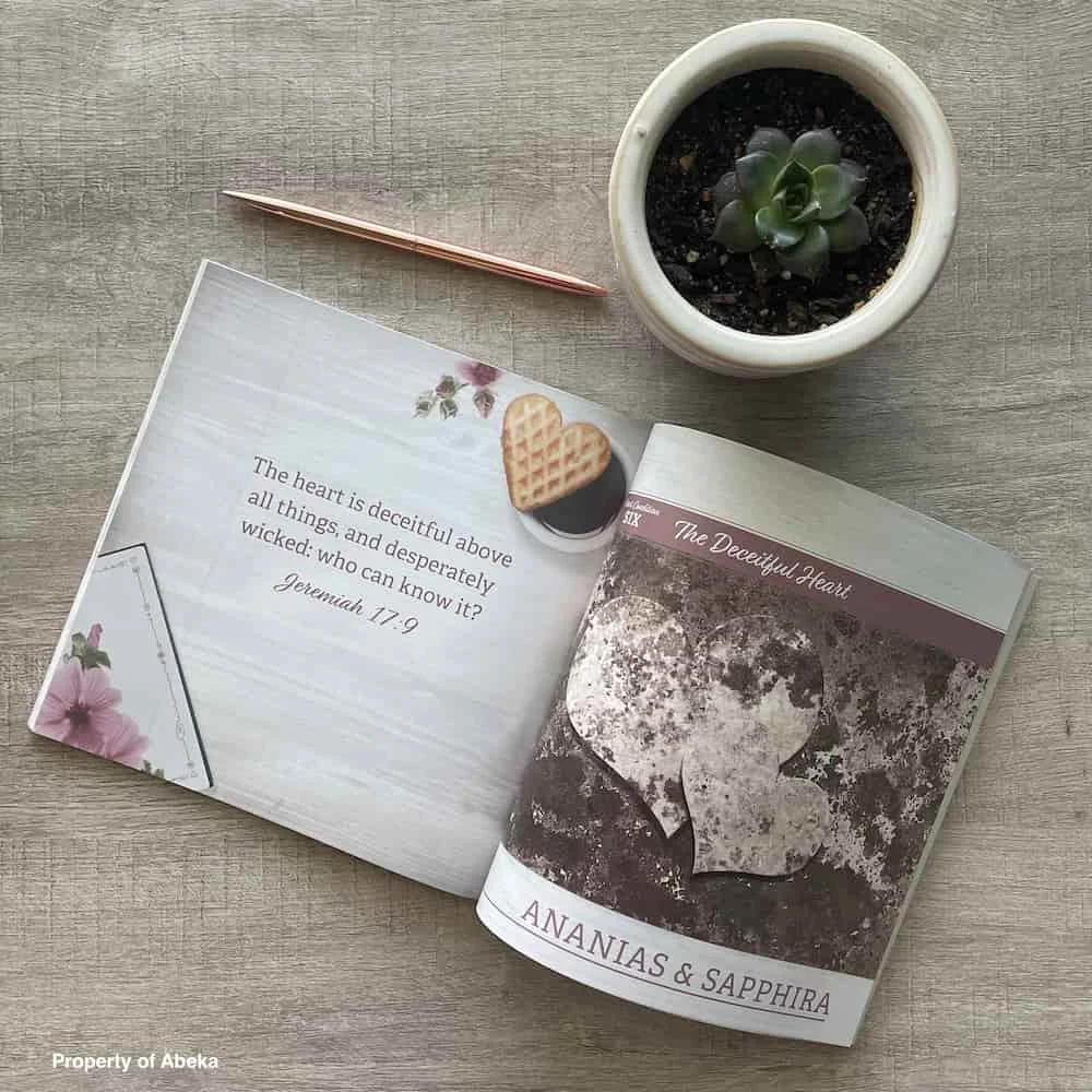
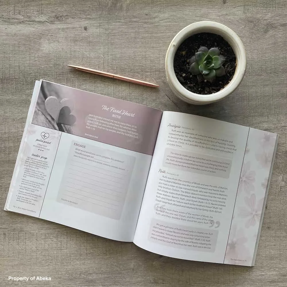
Product Photography Art Direction
Comprehensive Project Files
KEY INSIGHT
Sometimes the most meaningful brand work happens when we're holding space for both business growth and personal transformation. By treating Francie's story—and her husband's legacy—with the reverence it deserved, we created a brand that serves both her heart and her business goals. This is what ecosystem thinking really means: understanding that brands aren't just visual systems, they're extensions of the people who pour their lives into them.