

Keep the Heart
Taking Bible study from learning to living.
Original Logo
Client: Keep the Heart
Industry: Spiritual Resources
Package Category: Brand Refresh + Add-Ons (Single-Focus Brand)
Francie built Keep the Heart to create relatable resources that help people grow in their faith journey. The original logo, those intertwined hearts, was something she and her late husband designed together. When she came to us, she was navigating more than a brand refresh. She had recently lost her husband, relocated from Minnesota to Florida, and was stepping into a new chapter of both her life and her business. The logo needed to evolve, but changing something they had created together felt deeply significant. This project was never just about visual identity. It was about honoring what was built while making room for what's next.
-
Primary & Secondary Logo Refinement
Brand Style Guide
Business Card Design
Discount Card Design
Podcast Cover
Product Photography Art Direction
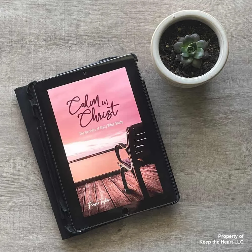
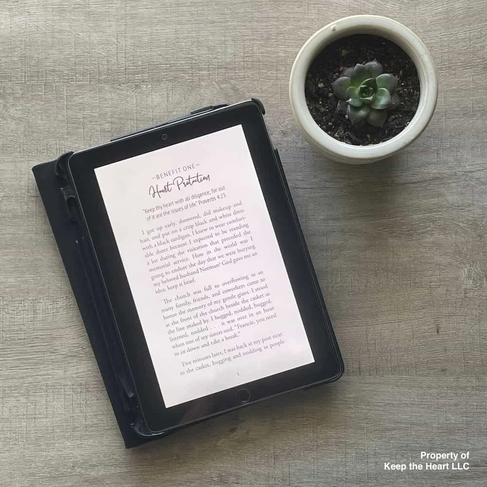
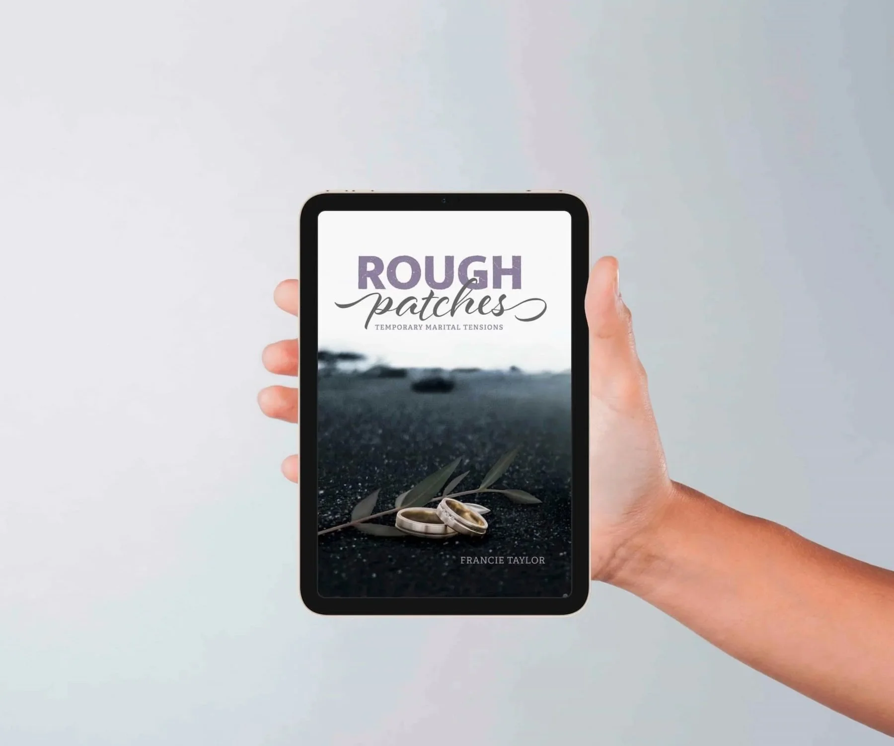
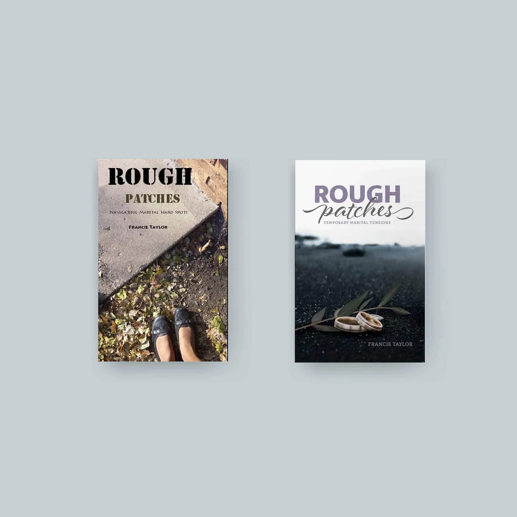
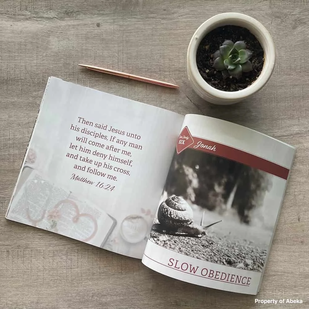
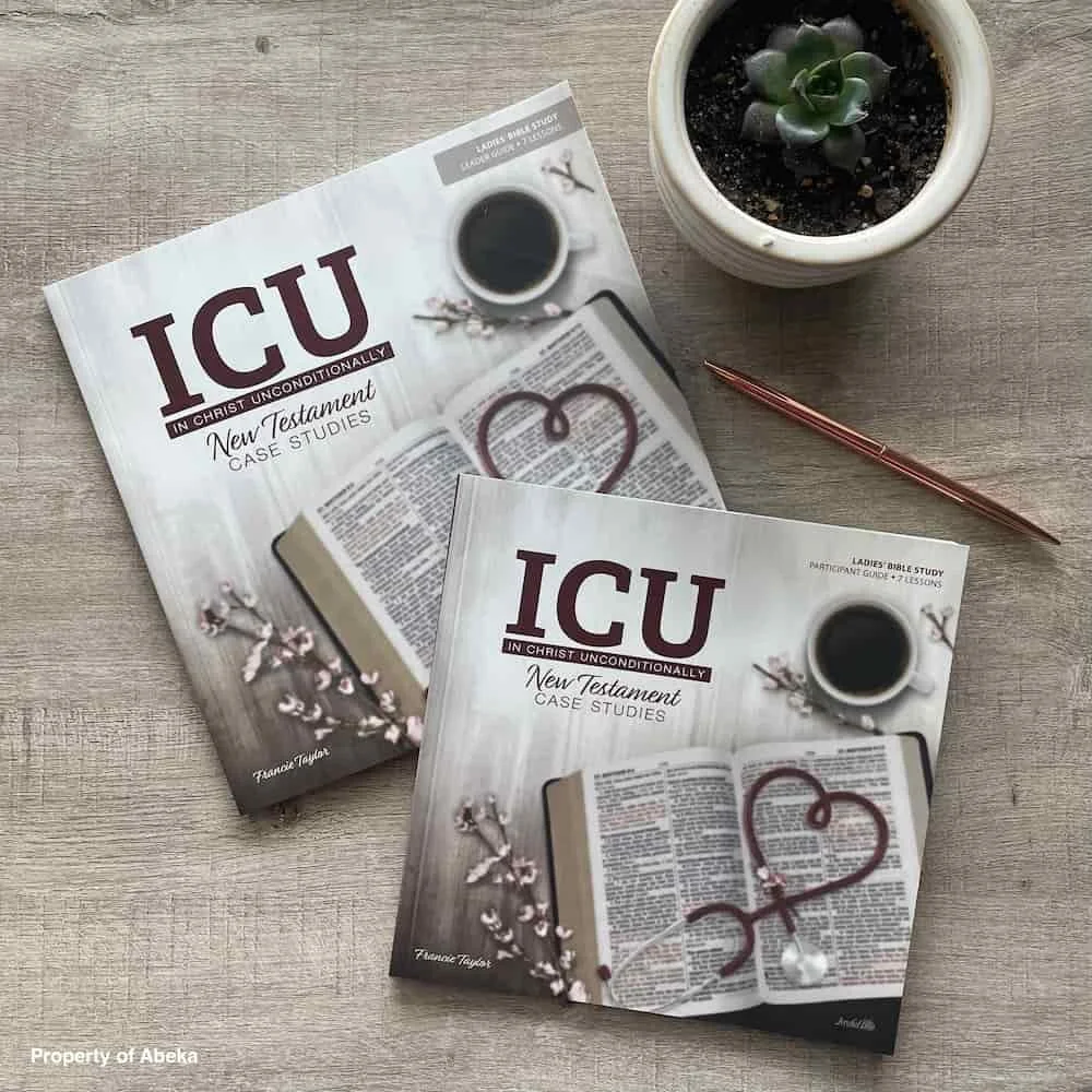
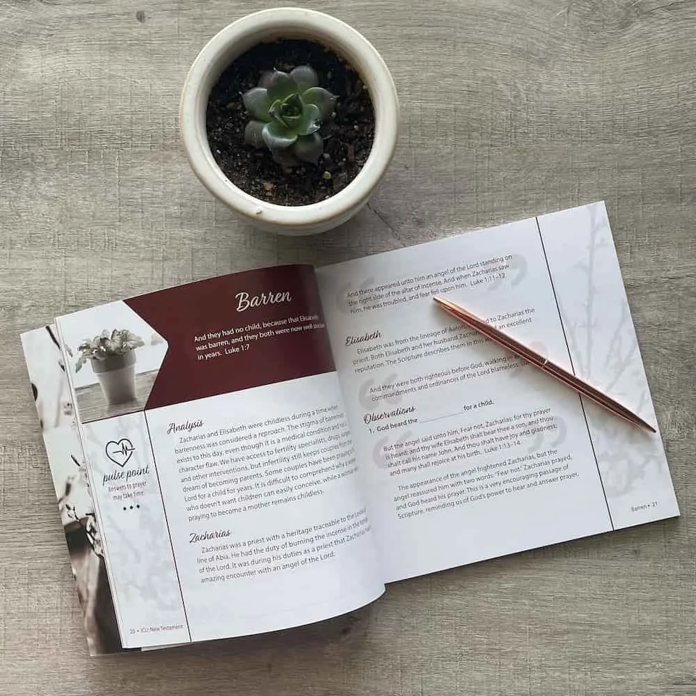
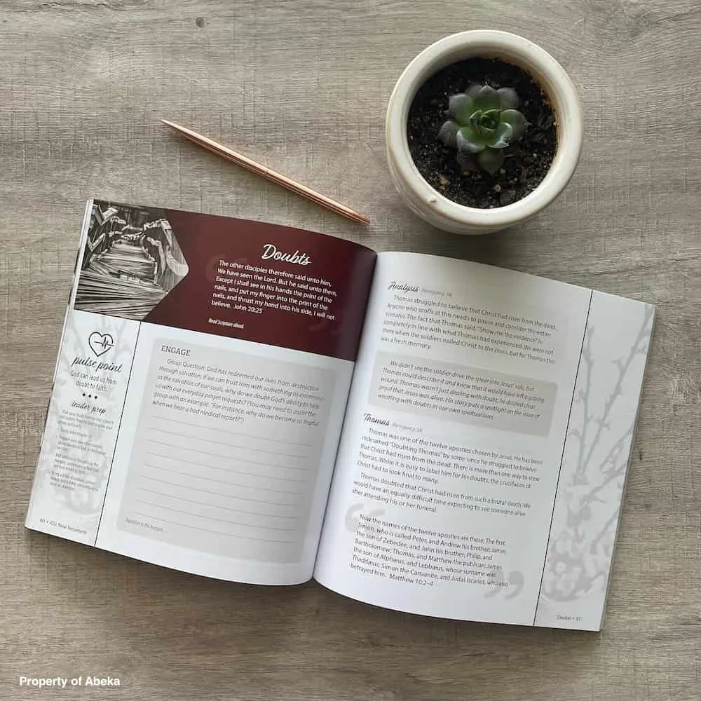
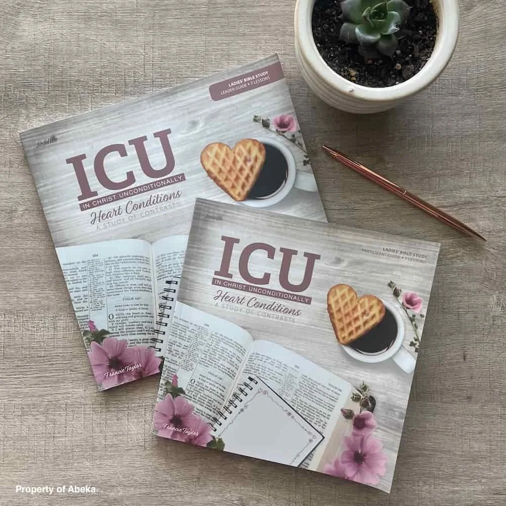
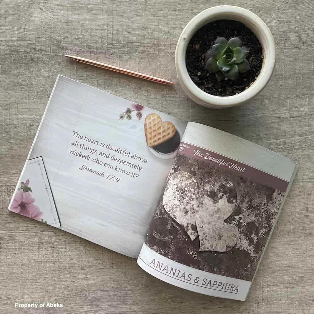
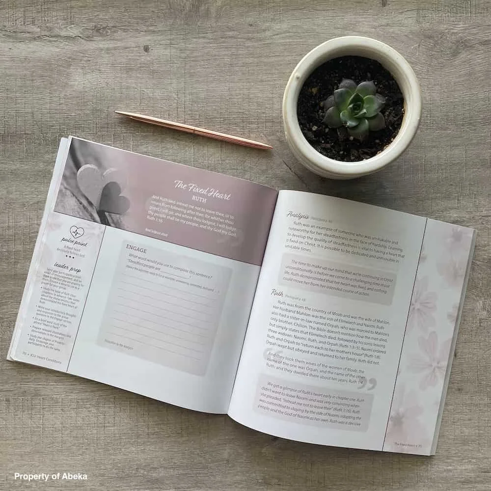
Book Design (5 Titles)
The Snapshot
THE TENSION
Francie knew her brand needed to grow with her. The original design had served her well, but it wasn't quite matching the professional level her ministry had reached. At the same time, those intertwined hearts weren't just a logo. They were a connection to her husband and to the season of life when Keep the Heart began. Any change had to feel like evolution, not erasure. The challenge wasn't just design. It was holding something sacred while helping it become something more.
THE TURNING POINT
We approached the intertwined hearts like the treasures they were. Rather than starting over, we refined what already existed, giving the hearts a hand-drawn treatment that felt both familiar and fresh. The updated color palette and improved consistency brought the professionalism Francie needed without losing the warmth that made Keep the Heart feel like home. Every decision was made with one question in mind: does this honor what came before while opening the door to what's ahead?
THE TRANSFORMATION
When Francie saw the refined logo, she could still see her husband's influence in those intertwined hearts. But she could also see herself in this new chapter, ready to keep building what they started together. Her community embraced the refresh because it felt like a loving tribute rather than a replacement. And for the first time, her brand matched the impact she was already making. Keep the Heart finally looked like where it was going.


THE TAKEAWAY
Some brand work requires more than strategy. It requires reverence. When a logo carries the memory of someone you've lost, changing it isn't a design decision. It's an emotional one. By treating Francie's story with the care it deserved, we created a brand that serves both her heart and her business, honoring the past while making space for everything still to come.